LTHL's Branded Email Redesign & Case Study
Below are three sets of email redesigns I did for Log & Timber Home Living's three digital brands, Log Home Living, Timber Home Living, and Cabin Life. In the left column you’ll see the original email and my thoughts about some of the design problems I found. In the middle column, you'll see my redesigned version of the email and my solutions to those design and usability issues. In the right column, you’ll see the modified version of the redesigned email that the digital marketing producer could actually build. All three brands’ emails were designed to reflect a consistent branded feel across them.
ROLE
Email Design, UX, Art Direction, Branding, Graphic Design, Typography

Original Email
This is the original email that needed to be redesigned. The main issue here is there wasn’t a clear definition as to what this email was presenting to the reader. There isn’t a clear title to the email and it’s confusing because “Log Home Living” is just the name of a digital editorial brand used across a website and social media channels. How this email was connected to that brand wasn’t clear.

Redesigned Email
In my redesigned email, I reworked the header so that not only the digital Log Home Living brand was defined with the newly redesigned logo and colors, but I also set apart the main body of the email with it’s own title so that the user could identify what this content was and who it was coming from. I did that by creating the illusion of placing the header and footer in the “background” negative that “wraps” around the main body positive space.

Final Modified Design
This adjusted design is what we (the digital web producer and I) settled on, as she wasn’t able to create that effect of the background “wrapping” around the main body content in her CMS. I am happy with the final design as it still achieves the clear hierarchy I was trying to establish (part of which was moving the social and website hyperlinks to the bottom,) as well as reflecting the new brand colors and icons.

Original Email
This is the original email that needed to be redesigned. The main issue here is there wasn’t a clear definition as to what this email was presenting to the reader. There isn’t a clear title to the email and it’s confusing because “Timber Home Living” is just the name of a digital editorial brand used across a website and social media channels. How this email was connected to that brand wasn’t clear.

Redesigned Email
In my redesigned email, I reworked the header so that not only the digital Timber Home Living brand was defined with the newly redesigned logo and colors, but I also set apart the main body of the email with it’s own title so that the user could identify what this content was and who it was coming from. I did that by creating the illusion of placing the header and footer in the “background” negative that “wraps” around the main body positive space.

Final Modified Design
This adjusted design is what we (the digital web producer and I) settled on, as she wasn’t able to create that effect of the background “wrapping” around the main body content in her CMS. I am happy with the final design as it still achieves the clear hierarchy I was trying to establish (part of which was moving the social and website hyperlinks to the bottom,) as well as reflecting the new brand colors and icons.

Original Email
This is the original email that needed to be redesigned. The main issue here is there wasn’t a clear definition as to what this email was presenting to the reader. There isn’t a clear title to the email and it’s confusing because “Cabin Life” is just the name of a digital editorial brand used across a website and social media channels. How this email was connected to that brand wasn’t clear.

Redesigned Email
In my redesigned email, I reworked the header so that not only the digital Cabin Life brand was defined with the newly redesigned logo, but also set apart the main body of the email with it’s own title so that the user could identify what this content was and who it was coming from. I did that by creating the illusion of placing the header and footer in the “background” that “wraps” around the main body content.
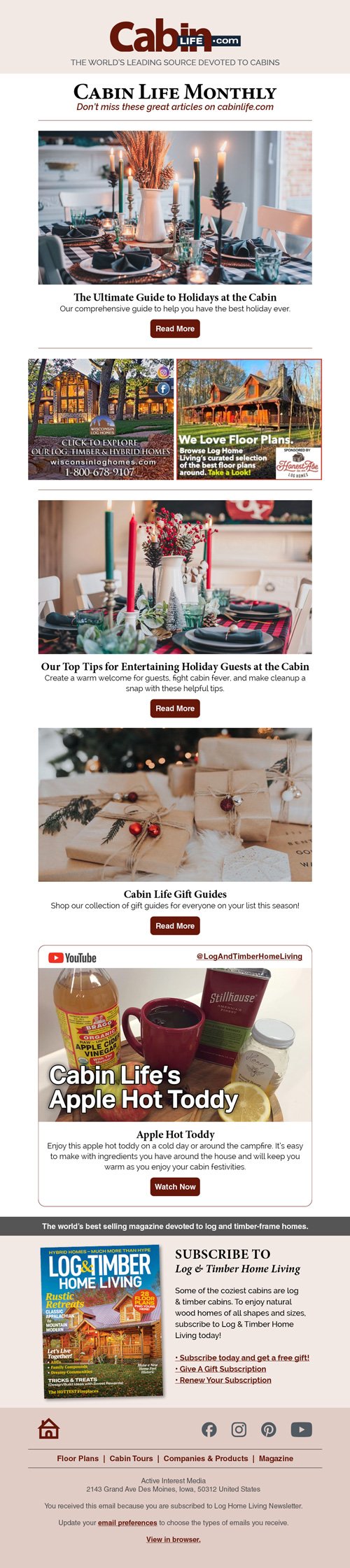
Final Modified Design
This adjusted design is what we (the digital web producer and I) settled on, as she wasn’t able to create that effect of the background “wrapping” around the main body content in her CMS. I am happy with the final design as it still achieves the clear hierarchy I was trying to establish (part of which was moving the social and website hyperlinks to the bottom,) as well as reflecting the new brand colors and icons.